Colour
From neglecting colours, to playfully chasing them, my relationship with chroma has changed in a year.
No magic trick obviously, but playful practice and some strategies to be more mindful about what I see have helped.
For me → Painting colours makes me see colours


Before starting my Diploma in September 2017, I tried to educate myself with online resources and learned about colour theory basics.
I genuinely get excited about building a mental image, an understanding of something quite abstract. Back then it wasn’t in my work yet but helps me loads now (from colour mixing to imaginary painting or composition device).

My first paintings weren’t very colourful, I guess I had understood that tone comes first and that was enough to deal with for a moment.
Values of light and dark are crucial, whereas colour can be more forgiven and quite personal. Trying to see colours merely in terms of tones is a whole exercise in itself and I reckon I still often get carried away with decisions that jump out from the whole.
One of the first palettes I heard off was the Zorn palette (after the Swedish painter Anders Zorn). Pretty limited, using yellow, cad red, titanium white and ivory black (acting as a blue in this context).
Black as a blue? that’s exciting!
I loved straight away the idea that colours were relating to a context, and that they could appear so different depending on their surrounding.
→ Painting isn’t to literally copy the source material, but to be consistent within its own parameters.


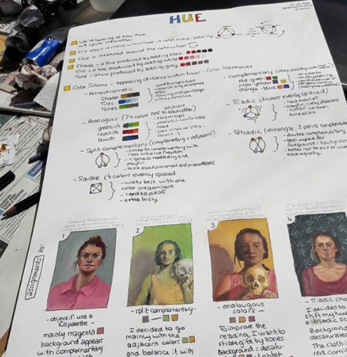
I think what made the biggest difference for me was to start naming colours.
I stopped saying ‘white/grey/brown/black’, as they refer to a tone (how dark or light) and saturation (grey as a cool muted colour, brown a warm one).
I also prefer to not be too fiddly with some ‘ish’ (blueish, reddish…) but rather definitive in my labels: at first, everything is either a primary or secondary (yellow / orange / red / purple / blue / green).
And I often keep painting in my head even without brushes, just by looking and naming (making good use of the stillness of modelling).

Painting is like an exciting puzzle that is built with limited resources. I love to thinking colours are an extra tool to play with.
Changes in temperature can help make things recede or come forward (that’s what I realised with the one on the left, where cooler colours helped push the feet into the distance).
Complementary colours can add some tension. This is probably why, on the right, I went for red shadows against this relatively green figure.

I was talking about the importance of tones just before, but to be honest now I rarely paint monochromes as I would prefer to use drawing materials for that.
Whereas focusing on tone + colour temperature is really enjoyable, helpful and often already plenty to deal with. It starts with a binary decision of cool and warm, and offers the whole range of tone and saturation.
In term of palette, it is a white, a brown and a blue. I like to experiment with various combination (steel blue/phthalo blue) + (burnt umber/burnt sienna). I particularly get excited when some of the blues seem to become greens or purples as they mix with white (all about the way you name it~).

I like binary decisions and limited palettes, and setting little exercises for myself (or maybe I just like indulging in my childhood photographs and I’m good to find reasons to do so).
Painting these tiny gouaches was helpful, even if not all equally successful. Trying to simplify what I was saying by restricting my access to colours or nuances: playing with saturated primaries and no white, or saturated primaries and a neutral halftone, or blue and yellow only (not great)…
I think the small scale allowed me to try various things without being too upset if the initial plan turned out to be weak.

Limited palettes help me feel that the process is more manageable, the decisions guaranteed to fit into a whole, and the possibilities just as infinite anyway.
The painting on the right was made with a limited palette of primaries, more than enough to find all the colours I wanted.
I also often change palettes and test them as I paint (left). Maybe for the excitement of looking for my destination without a map? and finding the scope of my possibilities, little by little, as I mix my colours.

There’s a thousand ways to approach colour: being playful is without a doubt is what works for me.
Simply put, life has so much beauty to offer, what a joy learning to contemplate!